Nintendo Switch 2 Game Menu Woes Frustrate Players
Nintendo Switch 2's exciting launch faces user frustration over clunky menus in Mario Kart World and Tears of the Kingdom, highlighting urgent UI improvements needed.
When the Nintendo Switch 2 launched on June 5, 2025, gamers were buzzing with excitement to dive into new titles like Mario Kart World and the enhanced Tears of the Kingdom. Both games quickly became system sellers, drawing in early adopters eager to experience smoother gameplay and upgraded visuals. But amid the thrill, players soon stumbled upon a shared annoyance that overshadowed the fun: frustrating menu interfaces. It's like they were so focused on racing or exploring Hyrule that navigating clunky UIs felt like hitting a speed bump in an otherwise smooth ride. Who would've thought that something as simple as selecting a character or sorting items could turn into such a chore?
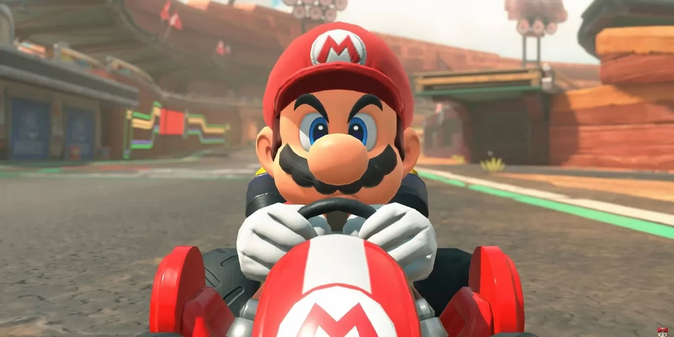
Take Mario Kart World, for instance. As the first brand-new console entry since Mario Kart 8 on the Wii U, it boasts a massive roster of characters—over 50, including new additions like Captain Toad and Rosalina variants. 😅 But players quickly realized that scrolling through this expansive list is a nightmare. The layout groups outfits as separate entries, forcing endless swiping just to find one character. It's not just about racing anymore; it's about battling the interface first. On the other side, Tears of the Kingdom's Switch 2 Edition offers higher resolution and a boosted frame rate, making the 2023 game feel fresh. Yet, its pop-up item menu during intense moments—say, when you're dodging a Lynel—can abruptly pull you out of the action. Imagine pausing mid-battle to sort through hundreds of items, only to lose momentum. Why did Nintendo make it so awkward? It's almost as if they underestimated how much time players spend in menus, turning quick decisions into slow, tedious processes.
Reddit user michael14375 sparked a huge conversation about this shared issue recently. In a post that garnered over 5.2K upvotes, they pointed out the cumbersome UI in both games and even mocked up potential fixes. For Mario Kart World, they suggested hiding outfit variants as subgroups—select a character, and the outfits appear without cluttering the main screen. For Tears of the Kingdom, they proposed adding rows that auto-group items by type, like weapons or materials, to speed up searches. 🎮 Here's a quick rundown of their ideas:
-
Mario Kart World Fix: Collapse variants under main characters; use tabs for quick access.
-
Tears of the Kingdom Fix: Implement dynamic sorting with categories such as combat or healing.
When michael14375 quipped, "Nintendo must think we like endless scrolling or something," it resonated deeply. The community's response was mixed but united on one point: improvements are overdue. Some argued that Tears of the Kingdom's quick menu allows sorting, but it's still clunky and unintuitive—like using a sledgehammer for a nail. Others debated the mock-ups, wondering if they'd work in practice. But the core frustration remains: why do modern games with such polish have such basic flaws? It makes you think about other titles; maybe this is a trend across the industry where flashy graphics overshadow user experience. 🤔
With Mario Kart World still fresh and Tears of the Kingdom being a couple of years old, updates could address these issues. Nintendo has a history of tweaking UIs post-launch, like they did with Animal Crossing. But will players have to wait months for a patch? That uncertainty hangs in the air. For now, gamers are stuck with workarounds, like memorizing item positions or avoiding certain menus altogether. What does this say about the balance between innovation and usability in gaming?
Ultimately, as players adapt, they can't help but ponder: Will Nintendo listen and revamp these menus in future updates, or will this frustration become a permanent part of the Switch 2 legacy?